Tuesday, 14 December 2010
Wednesday, 8 December 2010
Visual Language: Futurefarmers

Christian informed me about Future Farmers, although I think I may have heard about them before through a documentary called the Virtual Revolution based in the area Futurefarmers work.
They have a very impressive HTML5 website that I'm still trying to get my head around.
The collection of creatives is quite something; one of their projects particularly interests me. Transportationtown builds on the idea of SimCity but as an educational tool. It gives me an element of inspiration for what I might do.
Visual Language: Taxonomy of Languages

Visual Language: Virtual Environments
Here's another example of a virtual environment; this time animated.
In this, the user basically clicks and it leads them to another scene. Within one scene, some limited options are available such as activating a character or opening a door/window.
In this, the user basically clicks and it leads them to another scene. Within one scene, some limited options are available such as activating a character or opening a door/window.
Visual Language: A Visual Narrative

Google Street View is a book; a narrative that leads you through a virtual experience of life.
Users are encouraged to explore cities around the world, and people can end up wasting a lot of time exploring their cities in street view.
What if this time-wasting, yet interesting, experience could be captured for educational purposes?


Friday, 26 November 2010
Christmas Round Up
<div class="separator" style="clear: both; text-align: center;">
<object height="340" style="clear: right; float: right;" width="560"><param name="movie" value="http://www.youtube.com/v/mpV-xagkTDU?fs=1&hl=en_US">
</param>
<param name="allowFullScreen" value="true">
</param>
<param name="allowscriptaccess" value="always">
</param>
<embed src="http://www.youtube.com/v/mpV-xagkTDU?fs=1&hl=en_US" type="application/x-shockwave-flash" allowscriptaccess="always" allowfullscreen="true" width="560" height="340"></embed></object></div>
John Lewis focuses on the joy of giving gifts this Christmas. Their advert is notable in that it has launched another notable single for Ellie Goulding, 'Your Song'.
Interesting choice of song though. Big risk to choose a song with the forbidden word, 'money' in it. "I don't have much money" is a rather ironic lyric to have in a John Lewis advert, which to be blunt, has little time for people who don't have much money.
<object height="340" style="clear: right; float: right;" width="560"><param name="movie" value="http://www.youtube.com/v/q5QjzGMNOWI?fs=1&hl=en_US">
</param>
<param name="allowFullScreen" value="true">
</param>
<param name="allowscriptaccess" value="always">
</param>
<embed src="http://www.youtube.com/v/q5QjzGMNOWI?fs=1&hl=en_US" type="application/x-shockwave-flash" allowscriptaccess="always" allowfullscreen="true" width="560" height="340"></embed></object>M&S gives us an advert full of parodies, scopophilic dance routines and celebrities. It's clearly supposed to be a bit of fun; portraying what M&S can give you this Christmas supposedly.
Tuesday, 23 November 2010
Communication Technology: HTML 5

My housemate introduced me to this great website. Not only does it give a contextual introduction to HTML 5, it enables the user to have a go with some simple tutorials. On the whole, it seems that HTML 5 will make the way things work much simpler, easier and more impressive
The site itself is built in HTML 5 and the level of interactivity is great. I've posted a screen shot on the right, but to really appreciate the website you must visit it and have a play around.
The tutorials marry Javascript and ActionScript to show the potential possibilities. I'll certainly have a go at some of these, although the amount of time this would consume means it could form a whole new project.
I personally feel it is quite exciting being able to get the 'basics' out of the way and onto designing cutting edge web sites.
Wednesday, 17 November 2010
Communcation Technology: Comments Widget
 Today I came across this service, 'Disqus'. Disqus allows you to embed a commenting service onto your website; it's currently being used on the Transparency BETA for 10 Downing Street. Seems like it may be really helpful for me in trying to create more interactive websites though. All the syntax is relatively conventional; anyone used to using Facebook or Twitter would have no difficulty in using it.
http://disqus.com/
Wednesday, 10 November 2010
Tuesday, 9 November 2010
Communication Technology: ustwo: http://www.ustwo.co.uk/

I'm posting this website for two reasons; the design and the content.
Graphically, the site looks great. Really well chosen colours mix together to create a vibrant geometric background which is carried through to the container where the font is clean and legible. It's similar to Calibri but I can't find out exactly what it is as the CSS isn't showing.
Within the container is an embedded Flash banner. It works well as the user can scroll through 5 large images easily on the homepage, removing the need for clutter on standard HTML sites.
In terms of content, the website is for digital user interface design. In other words, they develop apps, games, content and other designs for mobiles, netbooks and tablets. I want to pick out their Sim City inspired design particularly, where the norm of gridded icons has been done away with and replaced with an interactive image.
Visually, the phone looks great. It's still in development so we'll have to wait and see for the reaction from the consumer, but I'm sure it will be a hit as form is preferred over function.
Monday, 8 November 2010
BBC loves EU?

A breach of neutrality? Whichever visual communicator decided this was a good image for the BBCs homepage banner perhaps needs to reconsider who they want to work for; the EU or the BBC?
Monday, 1 November 2010
Sunday, 31 October 2010


Saturday, 30 October 2010
Thursday, 28 October 2010
Wednesday, 27 October 2010
Tuesday, 19 October 2010
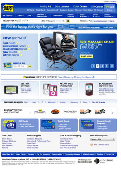
Communication Technology: Best Buy
Best Buy have recently broken into the UK market with their wide range of goods and services. A superbrand in its respective industry, Best Buy requires an extensive website shown below.
 As you can see, it has an online shop, features, brand listings, subcategory menus, contact information amongst a whole host of other things. Great, but what about people who are on the go? People who are in town and have just remembered they need to go to Best Buy?
 Best Buy has developed a mobile site shown left. The site has been considerably slimmed down to just two functions. A product search to act as a stock checker, and a store locator.
I experienced this problem first hand today, when I noticed the time was nearing 1700 and I wanted to find out when 'Size?' shut. Going on my mobile, I went to the 'Size?' website, where I had to zoom and scroll extensively before I found the store locator. This of course all took time, particularly on slow mobile internet. Once on the store locator, the opening/closing times were not even displayed.
So the key to a succesful mobile site is the absolute minimum amount of information, accessible with the minimum number of clicks and scrolls. Linking this with the St. George's website, it might mean the mobile version only displays service times and contact details.
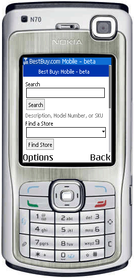
Saturday, 16 October 2010


Subscribe to:
Posts (Atom)